
Kendo UI for Vue
Vue Grid
- High-performance, feature-rich, and customizable data grid component.
- Part of the Kendo UI for Vue library along with 110+ professionally-designed components.
- Includes support, documentation, demos, virtual classrooms, learning resources and more!
-
Overview
The Kendo UI for Vue Grid is a data visualization and editing component that provides more than 100 ready-to-use features to manipulate the loaded data. Paging, sorting, filtering, editing, grouping, row & column virtualization, export to PDF, and Excel are part of the built-in functionality provided by the component. On top of these, the component is compliant with all Section 508 requirements, accessible by the popular screen readers, and provides full WAI-ARIA support.
Built from the ground up, with zero dependencies, the Kendo UI for Vue Grid delivers lightning-fast performance and highly customizable functionality based on the feedback and know-how collected during our 10+ years of experience in making enterprise-ready Grids.
-
Row and Column Virtualization
One of the most useful Grid component features, when talking about large datasets(hundreds of thousands of data items), is the Virtualization. With it, all columns or rows outside the currently visible area of the Grid will not be presented in the DOM tree, resulting in improved rendering performance and faster page and data load.
-
Loading Indicator
TheVue Data Grid includes a built-in indicator that displays when data operations are in progress. Any time data is loading, the user will see a spinning icon. Custom indicators are supported in cases where you need to implement your own.
-
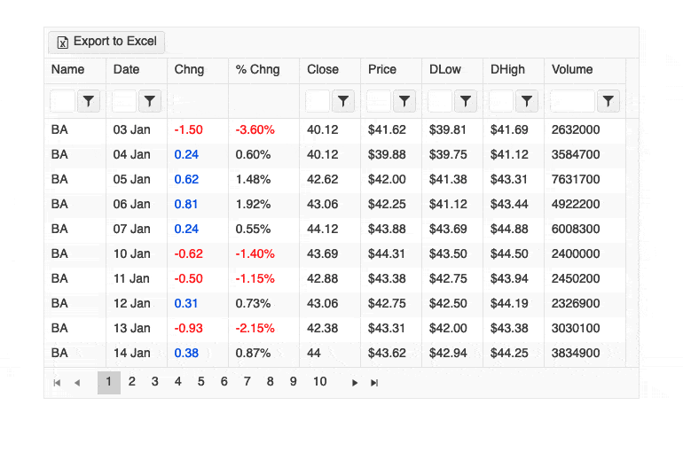
Paging
The Kendo UI for Vue Grid offers an intuitive functionality to browse through the component's data by changing pages with specific records size. The Previous, next, or the n-th data page can be easily accessed with a single click. The size of the pages can be pre-defined or changed dynamically by the user, reducing the overall amount of data loaded at once in the component. Using the Grid pages, you can improve the performance of your application and keep the users focused on selected data sets.
Kendo UI for Vue Grid – Paging Demo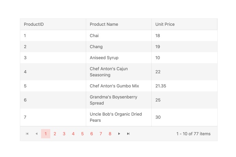
-
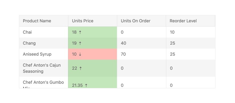
Sorting
The data sorting is one of the most important features of every data Grid. When the sorting is enabled for the Kendo UI for Vue Grid, the users can sort the columns’ data with a single click on their headers. Clicking on a column header changes the sorting mode between the three possible states - ascending, descending, or none.
The sorting can be applied to one or multiple columns simultaneously. Pre-defined and applied when the component is loaded or activated with a click when all data is presented, it is up to you to decide how to use the sorting feature of the Kendo UI for Vue Grid.
Kendo UI for Vue Grid – Sorting Demo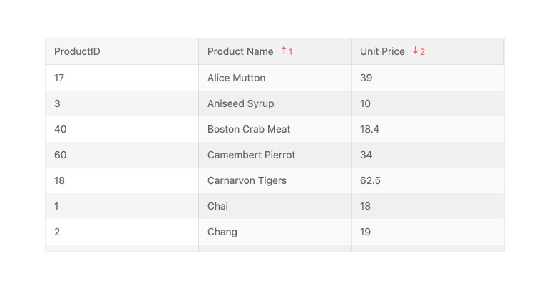
-
Filtering
The filtering features of the Kendo UI for Vue Grid can impress even the most demanding users. The component is shipped with multiple filter options that can be used in a dedicated filter row above each column or by clicking on the filter menu in the column header. For those who love to customize or change the built-in functionalities, the Grid provides a configuration to define a custom component that will handle the filtering of a selected data column.
Kendo UI for Vue Grid – Filtering demo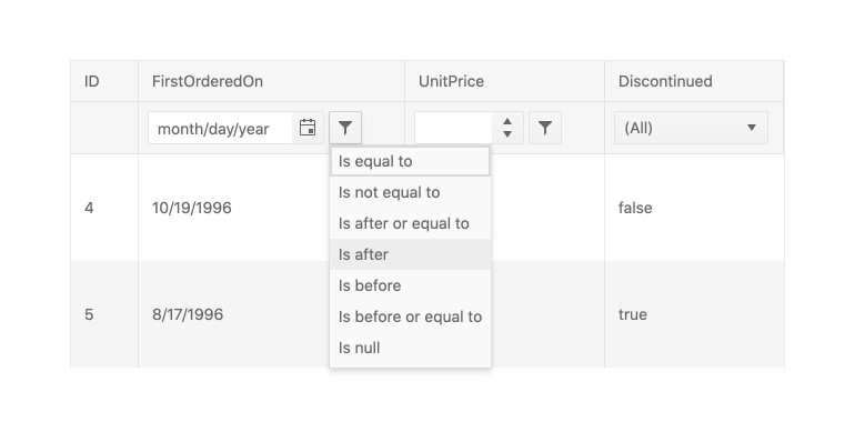
-
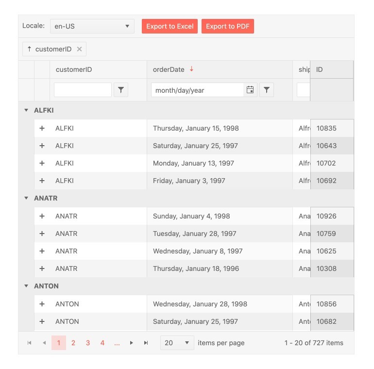
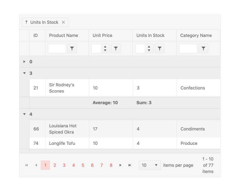
Grouping & Aggregates
The Grouping of the Kendo UI for Vue Grid allows the users to drag a column to the grouping header above the columns’ titles and thus group the data based on the values of the dragged and dropped cell. When grouped, each group inside the Grid can be expanded and collapsed individually. The groups can also be sorted. Last but not least, we can customize the header and footer of each group in a way it displays different aggregate information like “Average”, “Sum”, “Min” or “Max”.
-
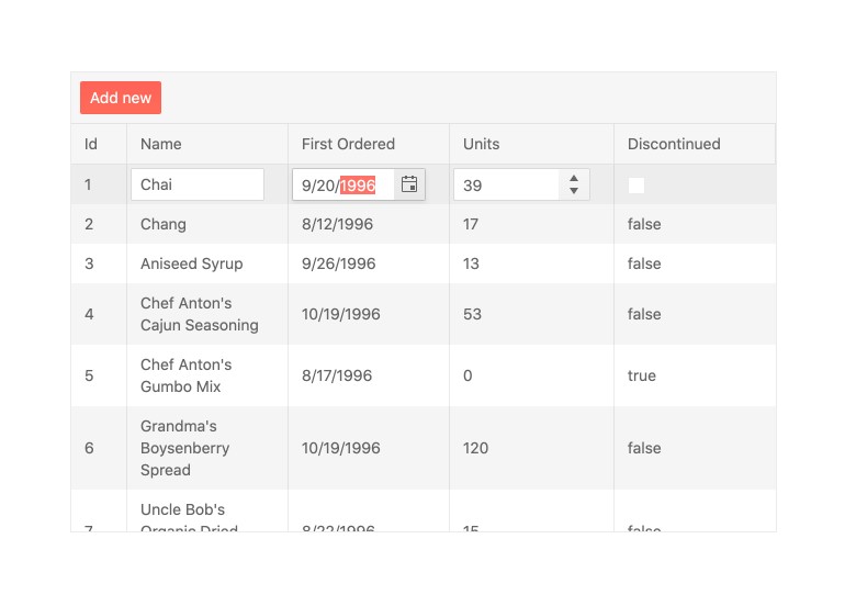
Editing
One of the popular use case scenarios of the Kendo UI for Vue Grid is the editing of its data items. To meet the requirements of all its users, the component provides three base data editing approaches:
- In-cell edit mode - Click on a cell and edit its data.
- Inline edit mode - Select a row and edit all data fields in the activated row.
- External form edit mode - Click a button and edit the row data in the external form that pops out
-
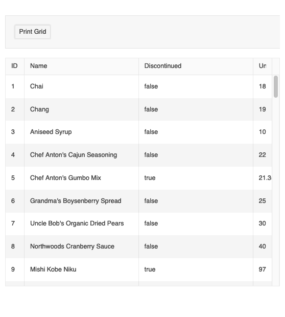
Printing
The Vue Data Grid supports a print layout enabling you to print all grid columns and rows with the corresponding content. You can print both scrollable and pageable grids.
-
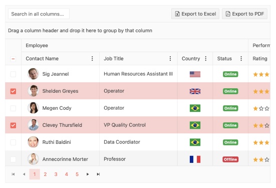
Selection
The Kendo UI for Vue Grid has built-in single and multiple rows selections. It also provides easy customization of the way the selected rows look like. The variety of component’s API provides methods for programmatically selecting the Grid rows, extract the data of the selected items, or interact with the data of the selected rows. For easier interaction, a column with checkboxes can be added to the component giving a more intuitive approach for row selection/deselection.
Kendo UI for Vue Grid - Selection Demo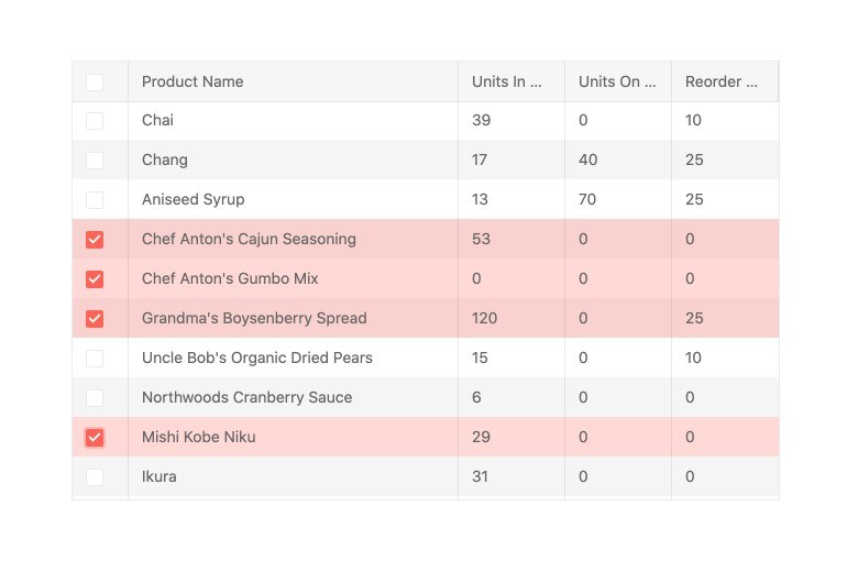
-
Column Interactions
The Kendo UI for Vue Grid allows the user to resize, reorder, drag for grouping, show or hide its columns. Each of the listed options can be specified for the component in general or defined column-by-column. With this number of configuration settings, the Grid gives the freedom of doing almost everything with its data and the way it is displayed.
Kendo UI for Vue Grid – Reordering Demo
-
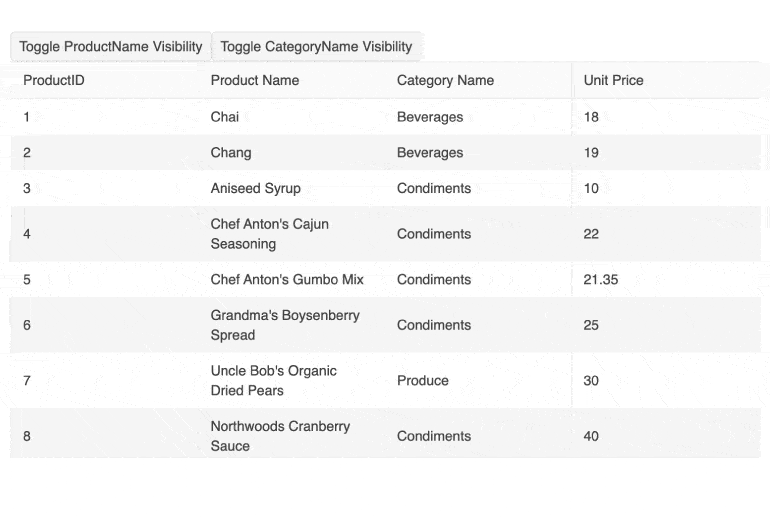
Dynamic Column Display
The Vue Data Grid supports scenarios where developers need to update columns when the underlying data model changes. This can include both showing and hiding columns as well as applying filters.
-
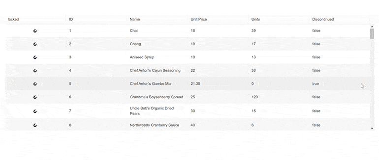
Locked Columns - Frozen & Sticky
When there are many columns in the Grid component, there often are scenarios in which we need one, two, or a random number of them to be constantly visible while scrolling the data. For such Grids, the component provides options to set the selected columns(IDs, edit command columns, other important columns, etc. ) as locked ones. With this configuration, we can lock columns at the beginning of the Grid, at its end, or even in the middle of the component. A middle column that is locked is called a “sticky” column and based on the horizontal scrolling it gets locked at the beginning or at the end of the Grid.
Kendo UI for Vue Grid – Locked columns demo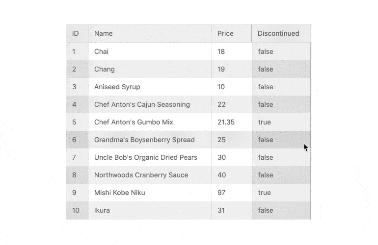
-
Sticky Rows
The Vue Data Grid allows you to specify rows to pin to the top of the bottom of the viewport. When that is done, they will “stick” to the top or the bottom when the user scrolls the view above or below them.
-
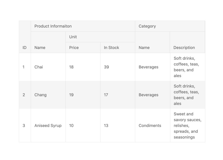
Multi-Column Headers
The column headers in the Grid are tied to the data fields bound to the component. Using the title configuration of the columns we can specify the columns’ titles but what happens when we need to share a title between two or more columns?
The Kendo UI for Vue Grid answers the above challenge with its Multi-Column Headers feature. With it, a column header can span across multiple sub-columns and thus achieve complex groupings and data structuring.
Kendo UI for Vue Grid – Multi-Header Columns
-
Responsive Columns
The Kendo UI for Vue Data Grid offers responsive web-design and adjusts its layout based on the available screen size. The responsive features include responsive columns and height adapting the grid size based on the container height.
-
Compact Sizing
Small screens are a primary channel for app delivery and developers are challenged with presenting data grid views in ways that device users can understand. To help solve this need, the Vue Data Grid now has a compact rendering mode. In this mode, cell padding will automatically be decreased regardless of the built-in theme used (Kendo Default, Material, Fluent, Bootstrap).
-
Export to Excel & PDF
The Kendo UI for Vue Grid has built-in integration with PDF and Excel export libraries providing out of the box export of its data to both of the popular formats. With just a single click, after the proper configurations are set, you can export all Grid data, only selected parts of it, or customize the unique look of the exported data, on the fly, before the result file is generated.
Check the Kendo UI for Vue Grid – PDF Export Demo & Kendo UI for Vue Grid – Excel Export Demo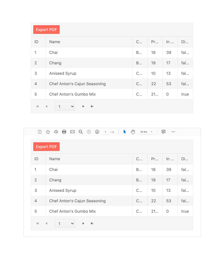
-
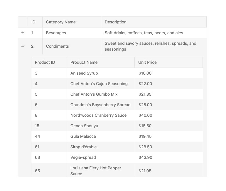
Hierarchy Grids
The Grid can load an unlimited number of sub-Grids forming a hierarchical parent-child relationship between the displayed data. With this hierarchical structure, the data displayed in the child Grids depends on the value of the parent rows. Each of the nested Grids can be configured with all the features available for the component or with a limited number of functionalities, based on the requirements of the business scenario.
-
Detail Rows
There are many scenarios in which we need to display additional information for a given Grid row using a user-friendly approach. This is where the Detail Rows feature of the Grid comes with the freedom it gives to the developers about the data that can be loaded below an “expanded row”. Thus just with a single click, you can display your custom content in the expanded Grid area.
Kendo UI for Vue Grid - Detail Rows demo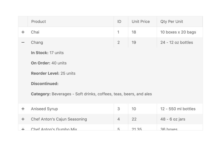
-
Custom Cells
When a more custom approach is needed in terms of data editing or displaying inside the Grid, the component provides the option to define a custom renderer for both the read and edit modes. With this feature supported by the component, the developer has the freedom to control everything displayed within the Kendo UI for Vue Grid.
-
Keyboard Navigation & Accessibility
The Grid component is accessible by the popular screen readers. It provides full WAI-ARIA accessibility support and is compliant with the Section 508 requirements. With its built-in keyboard navigation, the users can interact with all parts of the component or navigate through its data using only a keyboard.


Get Started with Kendo UI for Vue
